# Install and load necessary packages
pacman::p_load(
  tidyverse, ggrepel, ggthemes, hrbrthemes, patchwork
)Hands-on Exercise 2: Beyond ggplot2 Fundamentals
Setup
Import Data
# Read the exam data CSV
exam_data <- read_csv("/Users/sharon/OneDrive - Singapore Management University/isss608data/hands-on_exercise2/Exam_data.csv")
Rows: 322 Columns: 7
── Column specification ────────────────────────────────────────────────────────
Delimiter: ","
chr (4): ID, CLASS, GENDER, RACE
dbl (3): ENGLISH, MATHS, SCIENCE
ℹ Use `spec()` to retrieve the full column specification for this data.
ℹ Specify the column types or set `show_col_types = FALSE` to quiet this message.ggrepel: Prevent Overlapping Labels
ggplot(data = exam_data, aes(x = MATHS, y = ENGLISH)) +
  geom_point() +
  geom_smooth(method = lm, size = 0.5) +
  geom_label_repel(aes(label = ID), fontface = "bold") +
  coord_cartesian(xlim = c(0, 100), ylim = c(0, 100)) +
  ggtitle("English scores versus Maths scores for Primary 3")
Warning: Using `size` aesthetic for lines was deprecated in ggplot2 3.4.0.
ℹ Please use `linewidth` instead.`geom_smooth()` using formula = 'y ~ x'Warning: ggrepel: 317 unlabeled data points (too many overlaps). Consider
increasing max.overlaps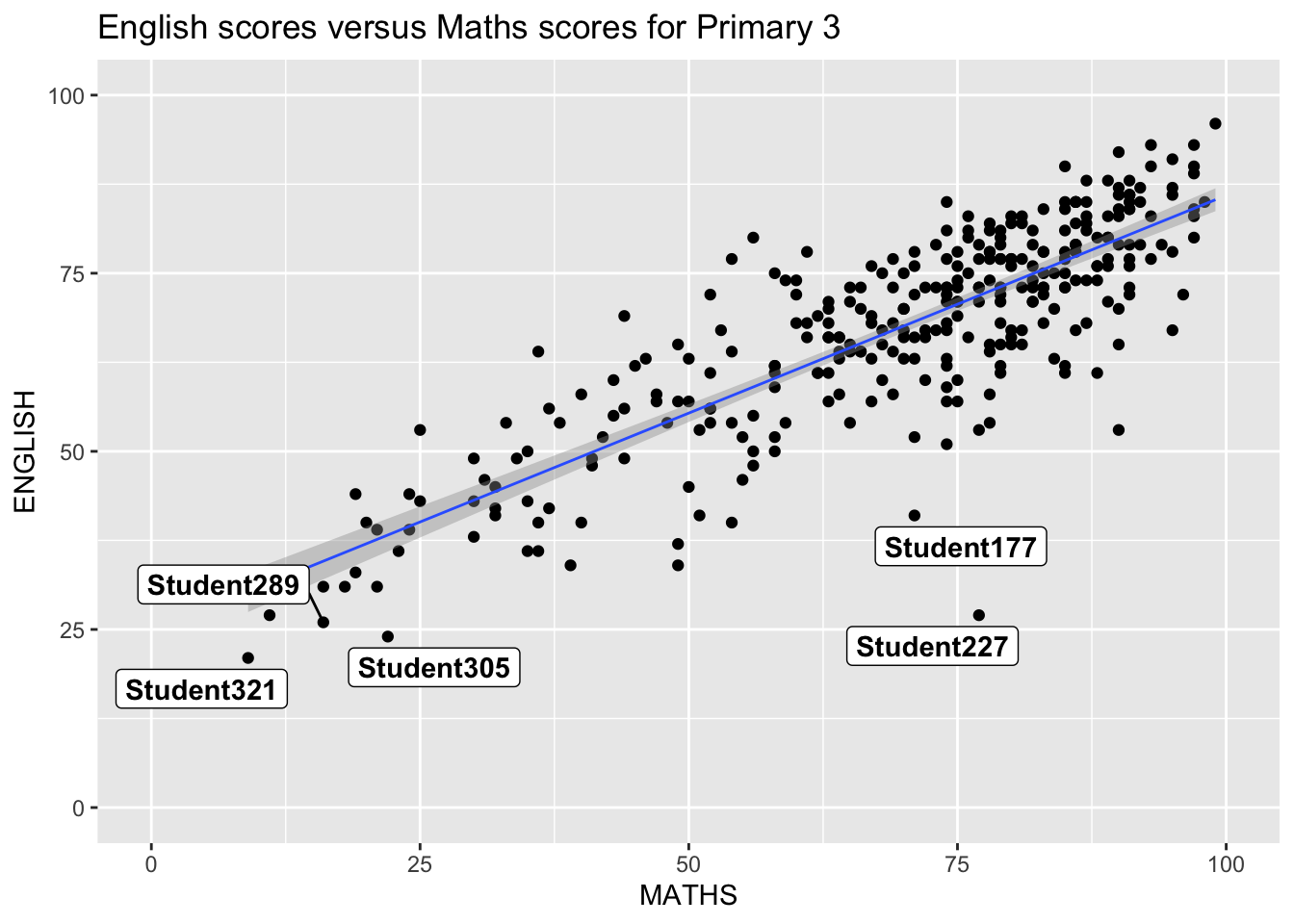
ggthemes: Using Predefined Themes
Base ggplot2 Theme
ggplot(data = exam_data, aes(x = MATHS)) +
  geom_histogram(bins = 20, boundary = 100, color = "grey25", fill = "grey90") +
  theme_gray() +
  ggtitle("Distribution of Maths scores")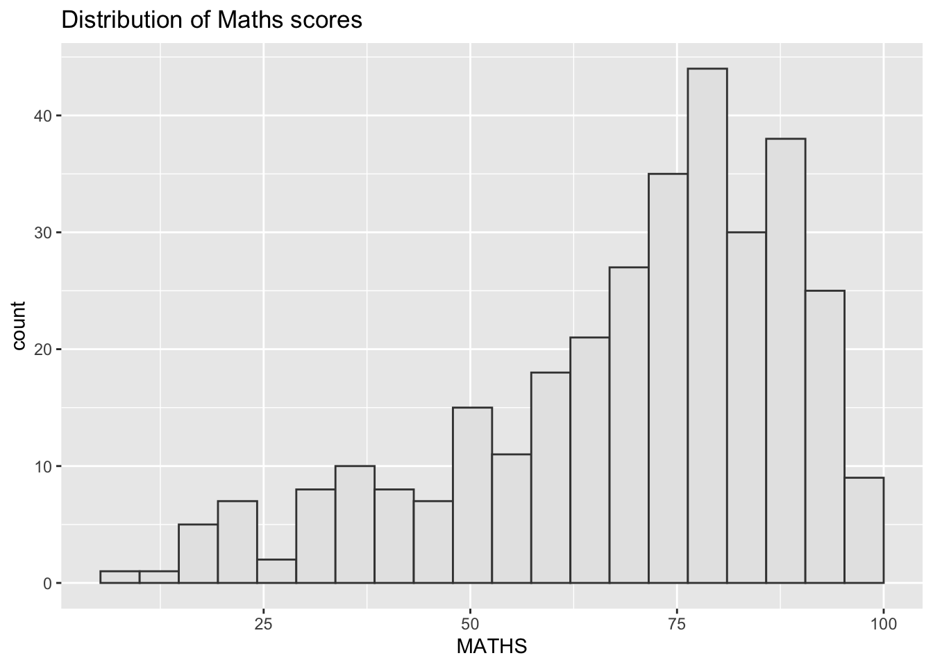
Economist Theme
ggplot(data = exam_data, aes(x = MATHS)) +
  geom_histogram(bins = 20, boundary = 100, color = "grey25", fill = "grey90") +
  ggtitle("Distribution of Maths scores") +
  theme_economist()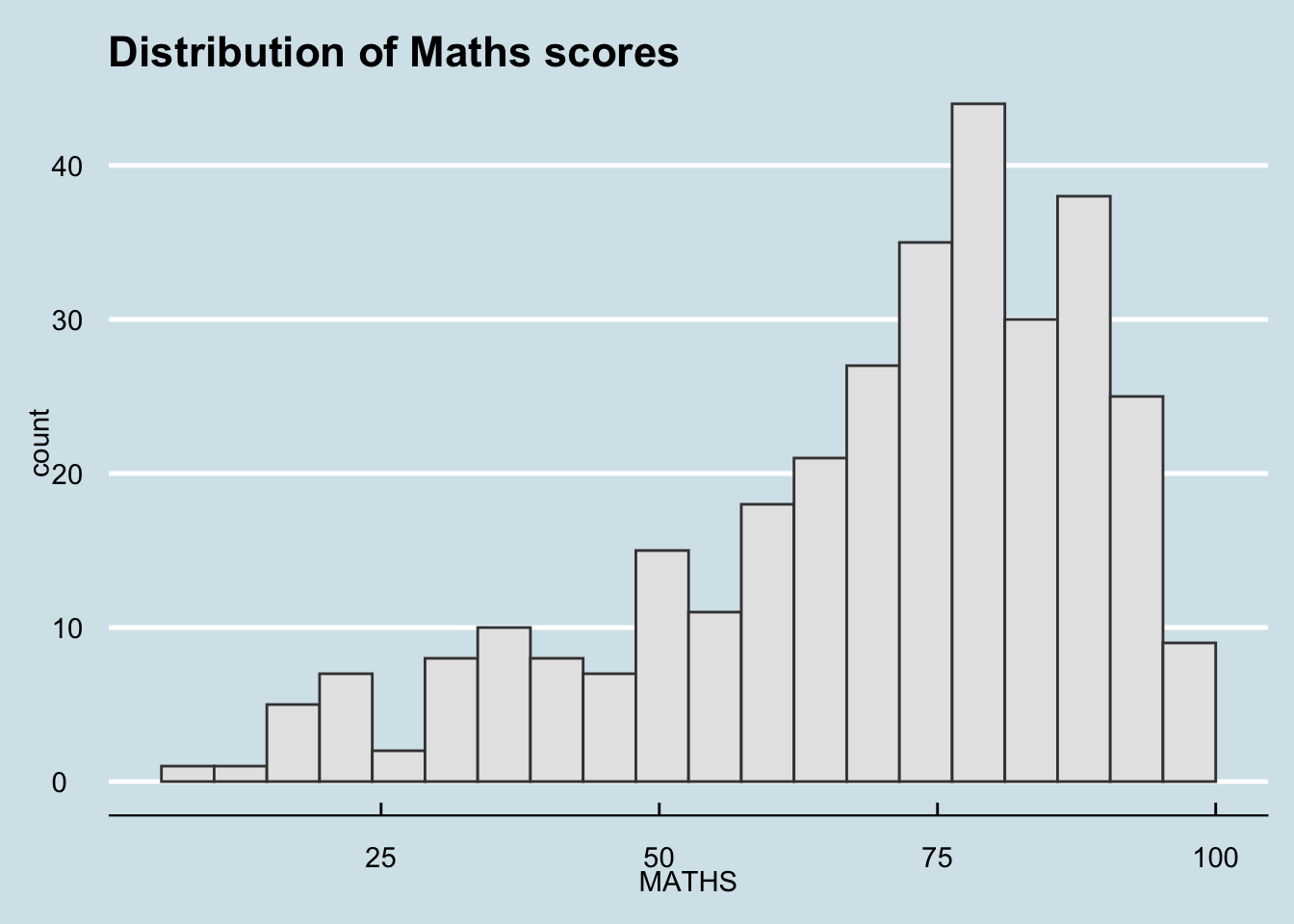
hrbrthemes: Typography-Centric Themes
Default hrbrthemes
ggplot(data = exam_data, aes(x = MATHS)) +
  geom_histogram(bins = 20, boundary = 100, color = "grey25", fill = "grey90") +
  ggtitle("Distribution of Maths scores") +
  theme_ipsum()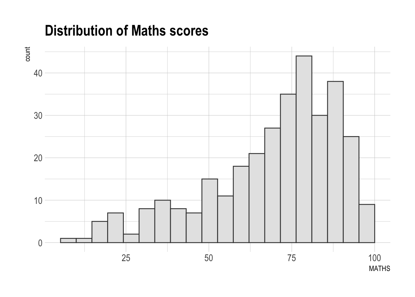
Customized Typography and Grid
ggplot(data = exam_data, aes(x = MATHS)) +
  geom_histogram(bins = 20, boundary = 100, color = "grey25", fill = "grey90") +
  ggtitle("Distribution of Maths scores") +
  theme_ipsum(axis_title_size = 18, base_size = 15, grid = "Y")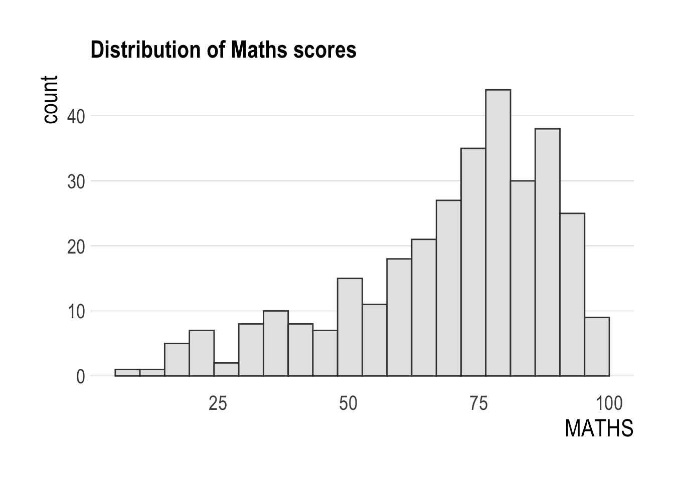
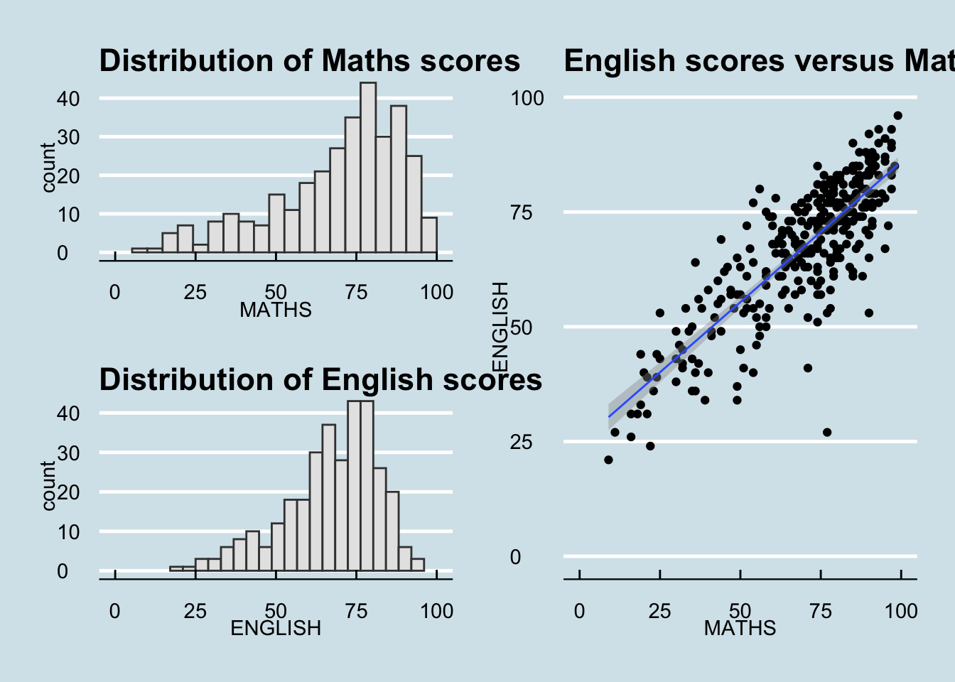
Composite Figures with Patchwork
Create Individual Plots
p1 <- ggplot(data = exam_data, aes(x = MATHS)) +
  geom_histogram(bins = 20, boundary = 100, color = "grey25", fill = "grey90") +
  coord_cartesian(xlim = c(0, 100)) +
  ggtitle("Distribution of Maths scores")

p2 <- ggplot(data = exam_data, aes(x = ENGLISH)) +
  geom_histogram(bins = 20, boundary = 100, color = "grey25", fill = "grey90") +
  coord_cartesian(xlim = c(0, 100)) +
  ggtitle("Distribution of English scores")

p3 <- ggplot(data = exam_data, aes(x = MATHS, y = ENGLISH)) +
  geom_point() +
  geom_smooth(method = lm, size = 0.5) +
  coord_cartesian(xlim = c(0, 100), ylim = c(0, 100)) +
  ggtitle("English scores versus Maths scores for Primary 3")
Combine Two Plots Horizontally
p1 + p2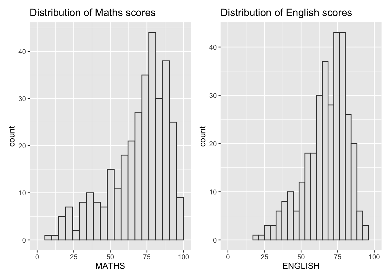
Combine Three Plots in Layout
(p1 / p2) | p3`geom_smooth()` using formula = 'y ~ x'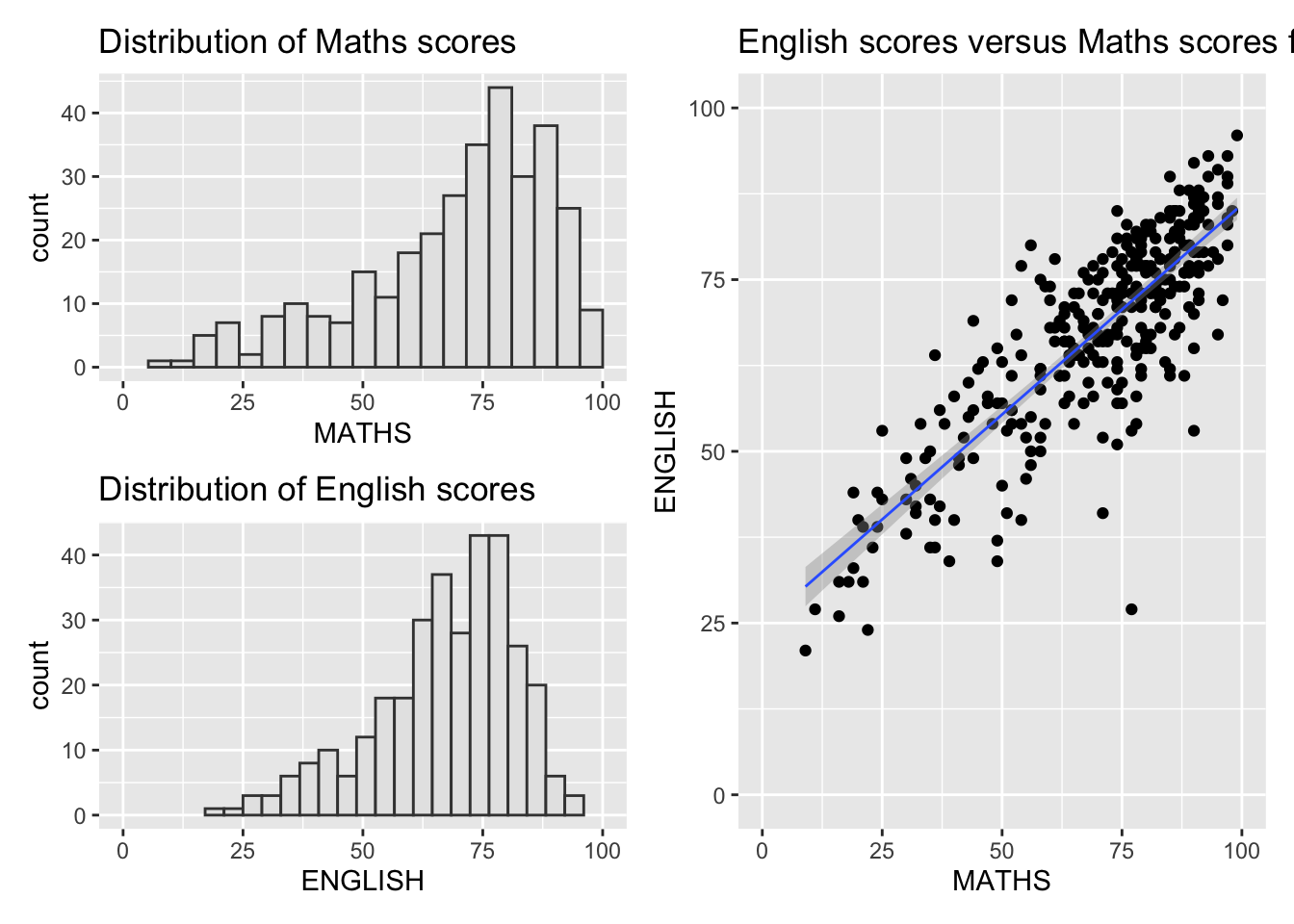
Add Auto-Tagging to Composite Plot
((p1 / p2) | p3) +
  plot_annotation(tag_levels = 'I')
`geom_smooth()` using formula = 'y ~ x'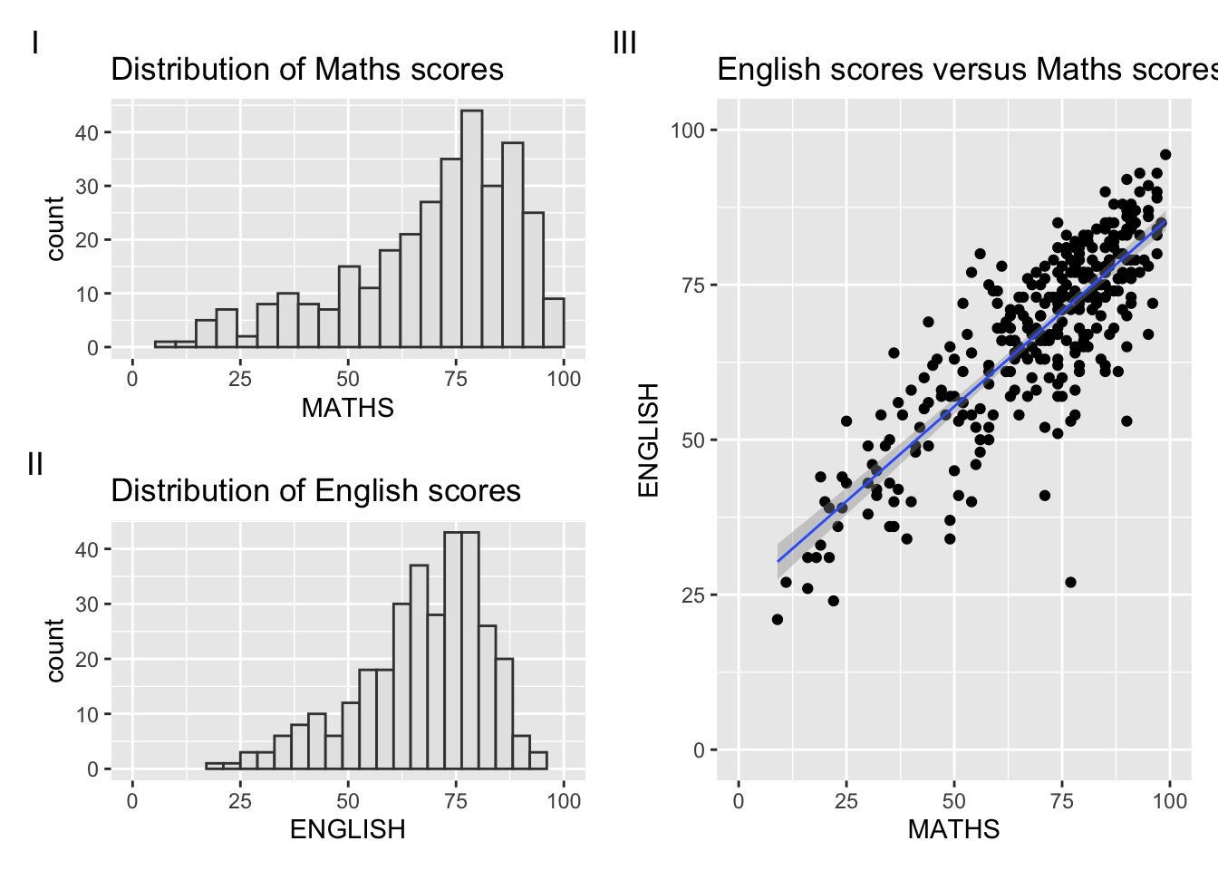
Add Inset Plot
p3 + inset_element(p2, left = 0.02, bottom = 0.7, right = 0.5, top = 1)`geom_smooth()` using formula = 'y ~ x'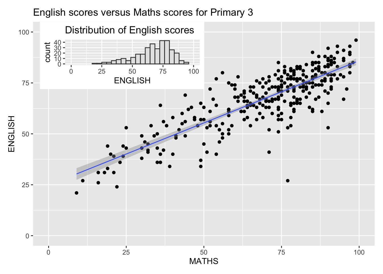
Combine Patchwork with ggthemes
patchwork <- (p1 / p2) | p3
patchwork & theme_economist()
`geom_smooth()` using formula = 'y ~ x'