1.1 Learning Outcome
By the end of this hands-on exercise you will be able create the followings data visualisation by using R packages:
plotting a calender heatmap by using ggplot2 functions,
plotting a cycle plot by using ggplot2 function,
plotting a slopegraph
plotting a horizon chart
1.2 Getting Started
Write a code chunk to check, install and launch the following R packages: scales, viridis, lubridate, ggthemes, gridExtra, readxl, knitr, data.table, and tidyverse.
<- c ("scales" , "viridis" , "lubridate" , "ggthemes" , "gridExtra" , "readxl" , "knitr" , "data.table" , "tidyverse" , "CGPfunctions" )<- rownames (installed.packages ())<- setdiff (required_packages, installed)if (length (to_install) > 0 ) {install.packages (to_install, repos = "https://cloud.r-project.org" )lapply (required_packages, library, character.only = TRUE )
Loading required package: viridisLite
Attaching package: 'viridis'
The following object is masked from 'package:scales':

    viridis_pal
Attaching package: 'lubridate'
The following objects are masked from 'package:base':

    date, intersect, setdiff, union
Attaching package: 'data.table'
The following objects are masked from 'package:lubridate':

    hour, isoweek, mday, minute, month, quarter, second, wday, week,
    yday, year
── Attaching core tidyverse packages ──────────────────────── tidyverse 2.0.0 ──
✔ dplyr   1.1.4     ✔ readr   2.1.5
✔ forcats 1.0.0     ✔ stringr 1.5.1
✔ ggplot2 3.5.2     ✔ tibble  3.2.1
✔ purrr   1.0.4     ✔ tidyr   1.3.1
── Conflicts ────────────────────────────────────────── tidyverse_conflicts() ──
✖ dplyr::between()      masks data.table::between()
✖ readr::col_factor()   masks scales::col_factor()
✖ dplyr::combine()      masks gridExtra::combine()
✖ purrr::discard()      masks scales::discard()
✖ dplyr::filter()       masks stats::filter()
✖ dplyr::first()        masks data.table::first()
✖ data.table::hour()    masks lubridate::hour()
✖ data.table::isoweek() masks lubridate::isoweek()
✖ dplyr::lag()          masks stats::lag()
✖ dplyr::last()         masks data.table::last()
✖ data.table::mday()    masks lubridate::mday()
✖ data.table::minute()  masks lubridate::minute()
✖ data.table::month()   masks lubridate::month()
✖ data.table::quarter() masks lubridate::quarter()
✖ data.table::second()  masks lubridate::second()
✖ purrr::transpose()    masks data.table::transpose()
✖ data.table::wday()    masks lubridate::wday()
✖ data.table::week()    masks lubridate::week()
✖ data.table::yday()    masks lubridate::yday()
✖ data.table::year()    masks lubridate::year()
ℹ Use the conflicted package (<http://conflicted.r-lib.org/>) to force all conflicts to become errors
[[1]]
[1] "scales"    "stats"     "graphics"  "grDevices" "utils"     "datasets"
[7] "methods"   "base"

[[2]]
 [1] "viridis"     "viridisLite" "scales"      "stats"       "graphics"
 [6] "grDevices"   "utils"       "datasets"    "methods"     "base"

[[3]]
 [1] "lubridate"   "viridis"     "viridisLite" "scales"      "stats"
 [6] "graphics"    "grDevices"   "utils"       "datasets"    "methods"
[11] "base"

[[4]]
 [1] "ggthemes"    "lubridate"   "viridis"     "viridisLite" "scales"
 [6] "stats"       "graphics"    "grDevices"   "utils"       "datasets"
[11] "methods"     "base"

[[5]]
 [1] "gridExtra"   "ggthemes"    "lubridate"   "viridis"     "viridisLite"
 [6] "scales"      "stats"       "graphics"    "grDevices"   "utils"
[11] "datasets"    "methods"     "base"

[[6]]
 [1] "readxl"      "gridExtra"   "ggthemes"    "lubridate"   "viridis"
 [6] "viridisLite" "scales"      "stats"       "graphics"    "grDevices"
[11] "utils"       "datasets"    "methods"     "base"

[[7]]
 [1] "knitr"       "readxl"      "gridExtra"   "ggthemes"    "lubridate"
 [6] "viridis"     "viridisLite" "scales"      "stats"       "graphics"
[11] "grDevices"   "utils"       "datasets"    "methods"     "base"

[[8]]
 [1] "data.table"  "knitr"       "readxl"      "gridExtra"   "ggthemes"
 [6] "lubridate"   "viridis"     "viridisLite" "scales"      "stats"
[11] "graphics"    "grDevices"   "utils"       "datasets"    "methods"
[16] "base"

[[9]]
 [1] "forcats"     "stringr"     "dplyr"       "purrr"       "readr"
 [6] "tidyr"       "tibble"      "ggplot2"     "tidyverse"   "data.table"
[11] "knitr"       "readxl"      "gridExtra"   "ggthemes"    "lubridate"
[16] "viridis"     "viridisLite" "scales"      "stats"       "graphics"
[21] "grDevices"   "utils"       "datasets"    "methods"     "base"

[[10]]
 [1] "CGPfunctions" "forcats"      "stringr"      "dplyr"        "purrr"
 [6] "readr"        "tidyr"        "tibble"       "ggplot2"      "tidyverse"
[11] "data.table"   "knitr"        "readxl"       "gridExtra"    "ggthemes"
[16] "lubridate"    "viridis"      "viridisLite"  "scales"       "stats"
[21] "graphics"     "grDevices"    "utils"        "datasets"     "methods"
[26] "base"
1.3 Plotting Calendar Heatmap
1.3.1 The Data
For the purpose of this hands-on exercise, eventlog.csv file will be used. This data file consists of 199,999 rows of time-series cyber attack records by country.
1.3.2 Importing the data
<- read_csv ("/Users/sharon/OneDrive - Singapore Management University/isss608data/hands-on_exercise6/eventlog.csv" )
Rows: 199999 Columns: 3
── Column specification ────────────────────────────────────────────────────────
Delimiter: ","
chr  (2): source_country, tz
dttm (1): timestamp

ℹ Use `spec()` to retrieve the full column specification for this data.
ℹ Specify the column types or set `show_col_types = FALSE` to quiet this message.
1.3.3 Examining the data structure
2015-03-12 15:59:16
CN
Asia/Shanghai
2015-03-12 16:00:48
FR
Europe/Paris
2015-03-12 16:02:26
CN
Asia/Shanghai
2015-03-12 16:02:38
US
America/Chicago
2015-03-12 16:03:22
CN
Asia/Shanghai
2015-03-12 16:03:45
CN
Asia/Shanghai
1.3.4 Data Preparation
<- function (ts, sc, tz) {<- ymd_hms (ts, tz = tz[1 ], quiet = TRUE )<- data.table (source_country = sc,wkday = weekdays (real_times),hour = hour (real_times))return (dt)<- c ('Saturday' , 'Friday' , 'Thursday' , 'Wednesday' , 'Tuesday' , 'Monday' , 'Sunday' )<- attacks %>% group_by (tz) %>% do (make_hr_wkday (.$ timestamp, .$ source_country, .$ tz)) %>% ungroup () %>% mutate (wkday = factor (wkday, levels = wkday_levels),hour = factor (hour, levels = 0 : 23 ))kable (head (attacks))
Africa/Cairo
BG
Saturday
20
Africa/Cairo
TW
Sunday
6
Africa/Cairo
TW
Sunday
8
Africa/Cairo
CN
Sunday
11
Africa/Cairo
US
Sunday
15
Africa/Cairo
CA
Monday
11
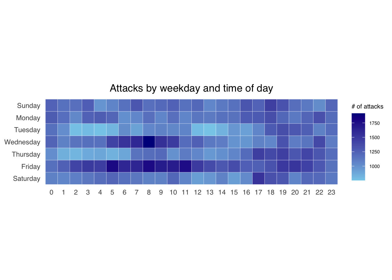
1.3.5 Building the Calendar Heatmaps
<- attacks %>% count (wkday, hour) %>% ungroup () %>% na.omit ()ggplot (grouped, aes (hour, wkday, fill = n)) + geom_tile (color = "white" , size = 0.1 ) + theme_tufte (base_family = "Helvetica" ) + coord_equal () + scale_fill_gradient (name = "# of attacks" , low = "sky blue" , high = "dark blue" ) + labs (x = NULL , y = NULL , title = "Attacks by weekday and time of day" ) + theme (axis.ticks = element_blank (),plot.title = element_text (hjust = 0.5 ),legend.title = element_text (size = 8 ),legend.text = element_text (size = 6 ))
Warning: Using `size` aesthetic for lines was deprecated in ggplot2 3.4.0.
ℹ Please use `linewidth` instead.
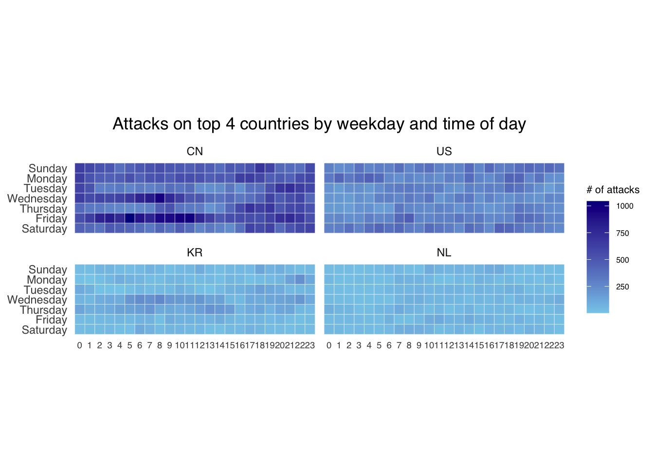
1.3.6 Building Multiple Calendar Heatmaps
1.3.7 Plotting Multiple Calendar Heatmaps
<- count (attacks, source_country) %>% mutate (percent = percent (n/ sum (n))) %>% arrange (desc (n))<- attacks_by_country$ source_country[1 : 4 ]<- attacks %>% filter (source_country %in% top4) %>% count (source_country, wkday, hour) %>% ungroup () %>% mutate (source_country = factor (source_country, levels = top4)) %>% na.omit ()ggplot (top4_attacks, aes (hour, wkday, fill = n)) + geom_tile (color = "white" , size = 0.1 ) + theme_tufte (base_family = "Helvetica" ) + coord_equal () + scale_fill_gradient (name = "# of attacks" , low = "sky blue" , high = "dark blue" ) + facet_wrap (~ source_country, ncol = 2 ) + labs (x = NULL , y = NULL , title = "Attacks on top 4 countries by weekday and time of day" ) + theme (axis.ticks = element_blank (),axis.text.x = element_text (size = 7 ),plot.title = element_text (hjust = 0.5 ),legend.title = element_text (size = 8 ),legend.text = element_text (size = 6 ))
1.4 Plotting Cycle Plot
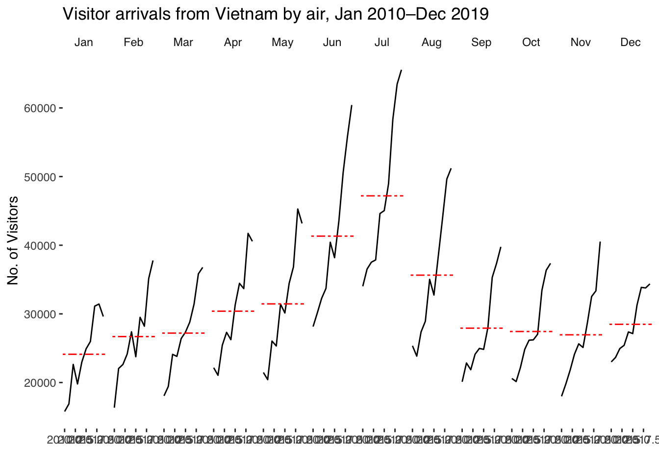
<- read_excel ("/Users/sharon/OneDrive - Singapore Management University/isss608data/hands-on_exercise6/arrivals_by_air.xlsx" )$ month <- factor (month (air$ ` Month-Year ` ), levels= 1 : 12 , labels= month.abb, ordered= TRUE ) $ year <- year (ymd (air$ ` Month-Year ` ))<- air %>% select (` Vietnam ` , month, year) %>% filter (year >= 2010 )<- Vietnam %>% group_by (month) %>% summarise (avgvalue = mean (` Vietnam ` , na.rm = TRUE ))ggplot () + geom_line (data= Vietnam,aes (x= year, y= ` Vietnam ` , group= month), colour= "black" ) + geom_hline (aes (yintercept= avgvalue), data= hline.data, linetype= 6 , colour= "red" , size= 0.5 ) + facet_grid (~ month) + labs (axis.text.x = element_blank (),title = "Visitor arrivals from Vietnam by air, Jan 2010–Dec 2019" ) + xlab ("" ) + ylab ("No. of Visitors" ) + theme_tufte (base_family = "Helvetica" )
1.5 Plotting Slopegraph
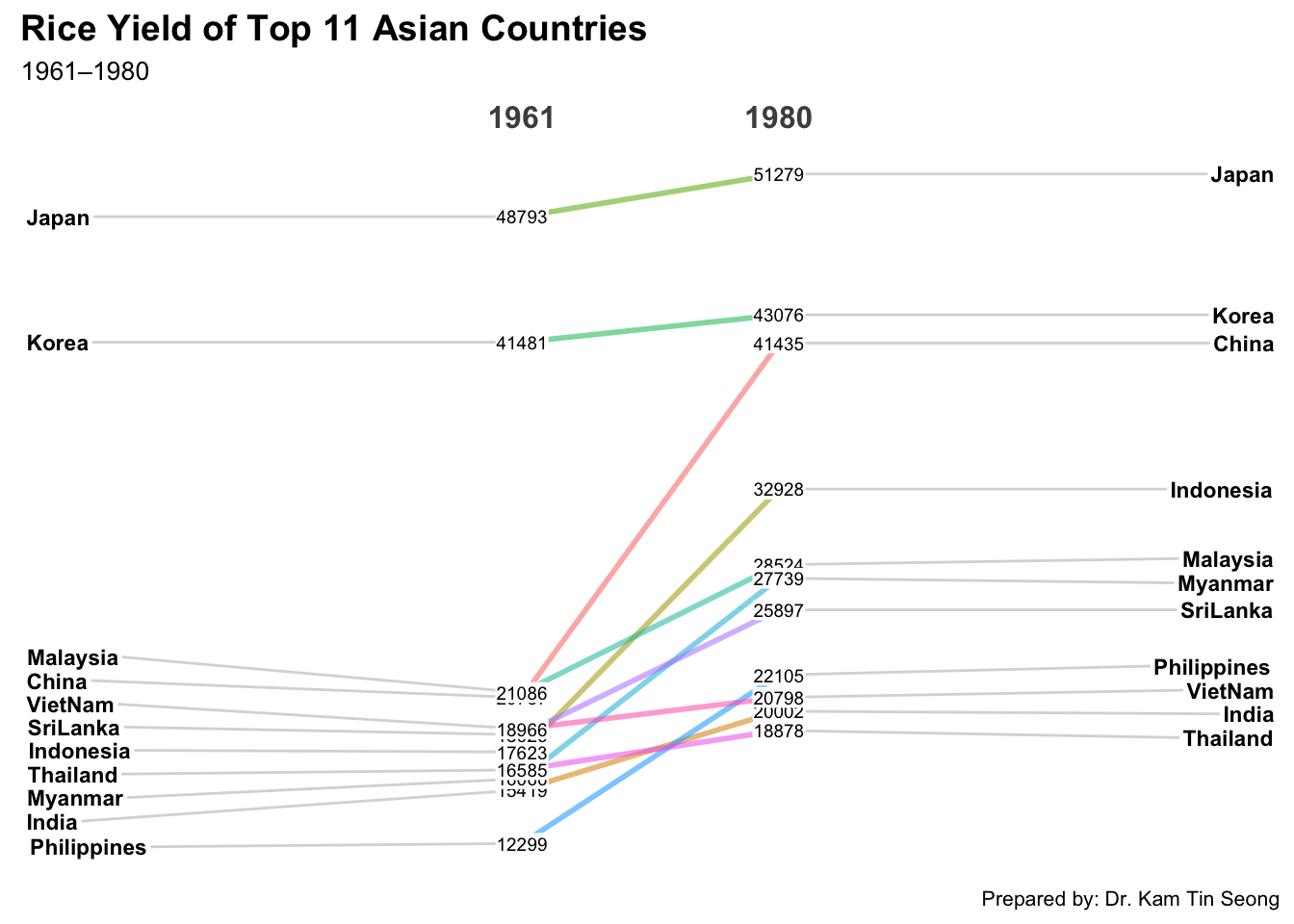
<- read_csv ("/Users/sharon/OneDrive - Singapore Management University/isss608data/hands-on_exercise6/rice.csv" )
Rows: 550 Columns: 4
── Column specification ────────────────────────────────────────────────────────
Delimiter: ","
chr (1): Country
dbl (3): Year, Yield, Production

ℹ Use `spec()` to retrieve the full column specification for this data.
ℹ Specify the column types or set `show_col_types = FALSE` to quiet this message.
%>% mutate (Year = factor (Year)) %>% filter (Year %in% c (1961 , 1980 )) %>% newggslopegraph (Year, Yield, Country,Title = "Rice Yield of Top 11 Asian Countries" ,SubTitle = "1961–1980" ,Caption = "Prepared by: Dr. Kam Tin Seong" )
Converting 'Year' to an ordered factor