pacman::p_load(plotly, crosstalk, DT,
               ggdist, ggridges, colorspace,
gganimate, tidyverse)Hands-on Exercise 4c: Visualising Uncertainty
11.1 Learning Outcome
- Plot statistics error bars using
ggplot2 - Plot interactive error bars using
ggplot2,plotly, andDT - Create advanced uncertainty visualizations using
ggdist - Create hypothetical outcome plots (HOPs) using the
ungevizpackage
11.2 Getting Started
11.2.1 Installing and Loading Packages
11.2.2 Importing the Data
exam <- read_csv("/Users/sharon/OneDrive - Singapore Management University/isss608data/hands-on_exercise2/Exam_data.csv")Rows: 322 Columns: 7
── Column specification ────────────────────────────────────────────────────────
Delimiter: ","
chr (4): ID, CLASS, GENDER, RACE
dbl (3): ENGLISH, MATHS, SCIENCE
ℹ Use `spec()` to retrieve the full column specification for this data.
ℹ Specify the column types or set `show_col_types = FALSE` to quiet this message.11.3 Visualizing the Uncertainty of Point Estimates
Summary Statistics
my_sum <- exam %>%
  group_by(RACE) %>%
  summarise(
    n = n(),
    mean = mean(MATHS),
    sd = sd(MATHS)
  ) %>%
  mutate(se = sd / sqrt(n - 1))
Display the Table
knitr::kable(head(my_sum), format = 'html')| RACE | n | mean | sd | se |
|---|---|---|---|---|
| Chinese | 193 | 76.50777 | 15.69040 | 1.132357 |
| Indian | 12 | 60.66667 | 23.35237 | 7.041005 |
| Malay | 108 | 57.44444 | 21.13478 | 2.043177 |
| Others | 9 | 69.66667 | 10.72381 | 3.791438 |
11.3.1 Standard Error Bars
ggplot(my_sum) +
  geom_errorbar(
    aes(x = RACE, ymin = mean - se, ymax = mean + se),
    width = 0.2, colour = "black", alpha = 0.9, linewidth = 0.5
  ) +
  geom_point(
    aes(x = RACE, y = mean),
    stat = "identity", color = "red", size = 1.5, alpha = 1
  ) +
  ggtitle("Standard error of mean maths score by race")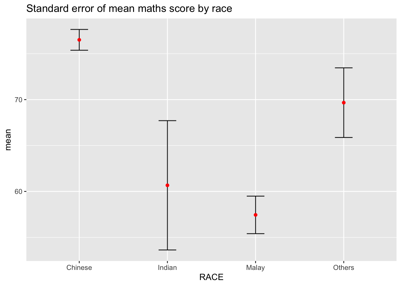
11.3.2 95% Confidence Interval
ggplot(my_sum) +
  geom_errorbar(
    aes(x = reorder(RACE, -mean), ymin = mean - 1.96 * se, ymax = mean + 1.96 * se),
    width = 0.2, colour = "black", alpha = 0.9, linewidth = 0.5
  ) +
  geom_point(
    aes(x = RACE, y = mean),
    stat = "identity", color = "red", size = 1.5, alpha = 1
  ) +
  labs(x = "Maths score", title = "95% confidence interval of mean maths score by race")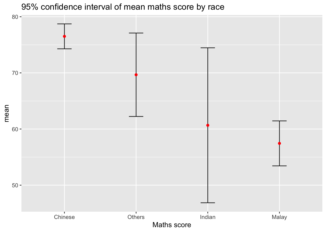
11.3.3 99% Confidence Interval with Interactive Plot
shared_df = SharedData$new(my_sum)

bscols(widths = c(4, 8),
  ggplotly(
    ggplot(shared_df) +
      geom_errorbar(aes(x = reorder(RACE, -mean), ymin = mean - 2.58 * se, ymax = mean + 2.58 * se),
                    width = 0.2, colour = "black", alpha = 0.9, size = 0.5) +
      geom_point(aes(x = RACE, y = mean,
                     text = paste("Race:", RACE, "<br>N:", n,
                                  "<br>Avg. Scores:", round(mean, 2),
                                  "<br>99% CI:[", round(mean - 2.58 * se, 2), ",",
                                  round(mean + 2.58 * se, 2), "]")),
                 stat = "identity", color = "red", size = 1.5, alpha = 1) +
      xlab("Race") + ylab("Average Scores") +
      theme_minimal() +
      theme(axis.text.x = element_text(angle = 45, vjust = 0.5, hjust = 1)) +
      ggtitle("99% Confidence interval of average maths scores by race"),
    tooltip = "text"
  ),
  DT::datatable(shared_df, rownames = FALSE, class = "compact", width = "100%",
                options = list(pageLength = 10, scrollX = TRUE),
                colnames = c("No. of pupils", "Avg Scores", "Std Dev", "Std Error")) %>%
    formatRound(columns = c("mean", "sd", "se"), digits = 2)
)
Warning: Using `size` aesthetic for lines was deprecated in ggplot2 3.4.0.
ℹ Please use `linewidth` instead.Warning in geom_point(aes(x = RACE, y = mean, text = paste("Race:", RACE, :
Ignoring unknown aesthetics: text11.4 Visualising Uncertainty with ggdist
11.4.1 Basic Point + Interval Plot
exam %>%
  ggplot(aes(x = RACE, y = MATHS)) +
  stat_pointinterval() +
  labs(title = "Visualising confidence intervals of mean math score",
       subtitle = "Mean Point + Multiple-interval plot")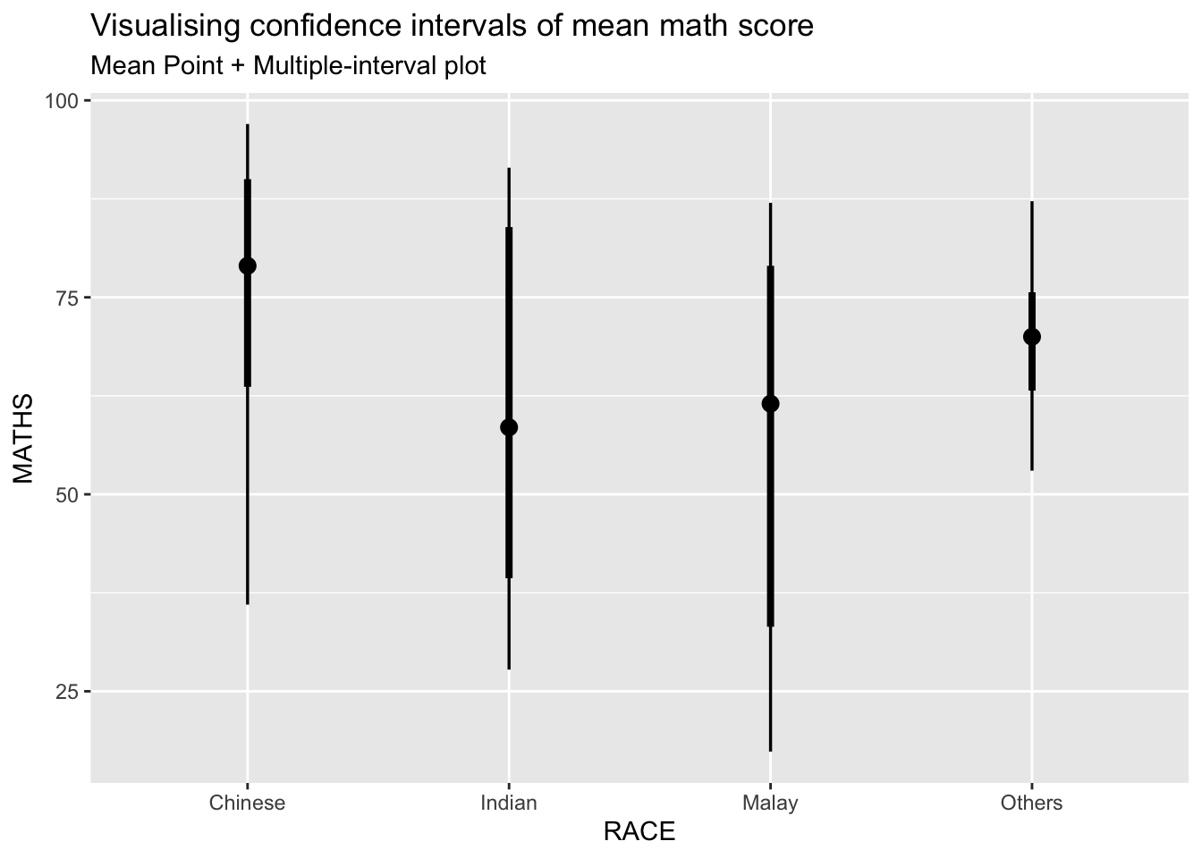
11.4.2 Median + 95% Confidence Intervals
exam %>%
  ggplot(aes(x = RACE, y = MATHS)) +
  stat_pointinterval(.width = 0.95, .point = median, .interval = qi) +
  labs(title = "Visualising confidence intervals of median math score",
       subtitle = "Median Point + Multiple-interval plot")
Warning in layer_slabinterval(data = data, mapping = mapping, stat =
StatPointinterval, : Ignoring unknown parameters: `.point` and `.interval`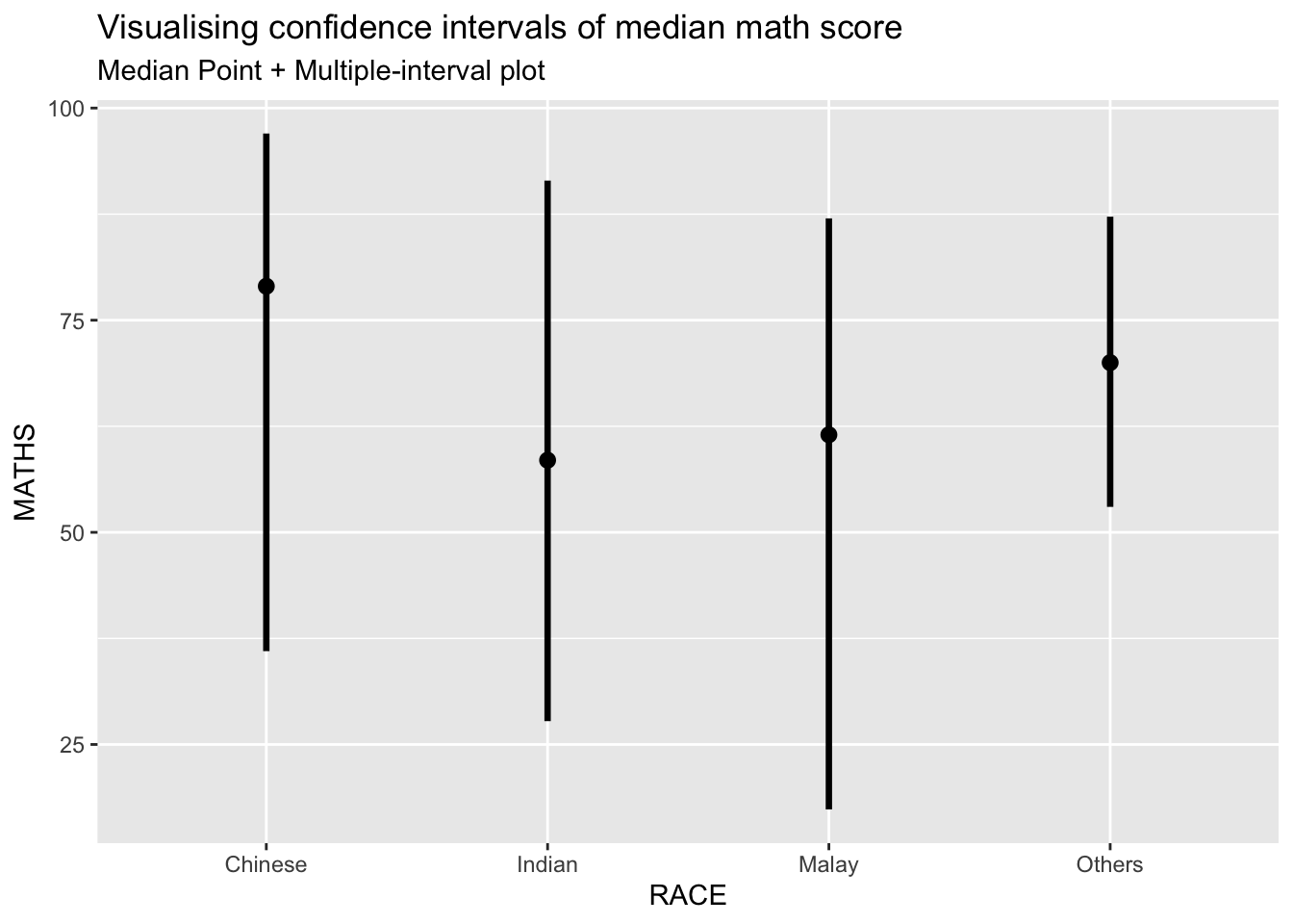
11.4.3 Showing Both 95% and 99% CI
exam %>%
  ggplot(aes(x = RACE, y = MATHS)) +
  stat_pointinterval(.width = c(0.95, 0.99), show.legend = FALSE) +
  labs(title = "Visualising 95% and 99% confidence intervals",
       subtitle = "Mean Point + Multiple-interval plot")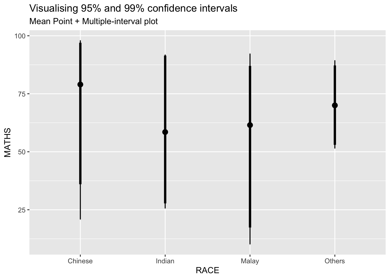
11.4.4 Gradient + Interval Plot
exam %>%
  ggplot(aes(x = RACE, y = MATHS)) +
  stat_gradientinterval(fill = "skyblue", show.legend = TRUE) +
  labs(title = "Visualising confidence intervals of mean math score",
       subtitle = "Gradient + interval plot")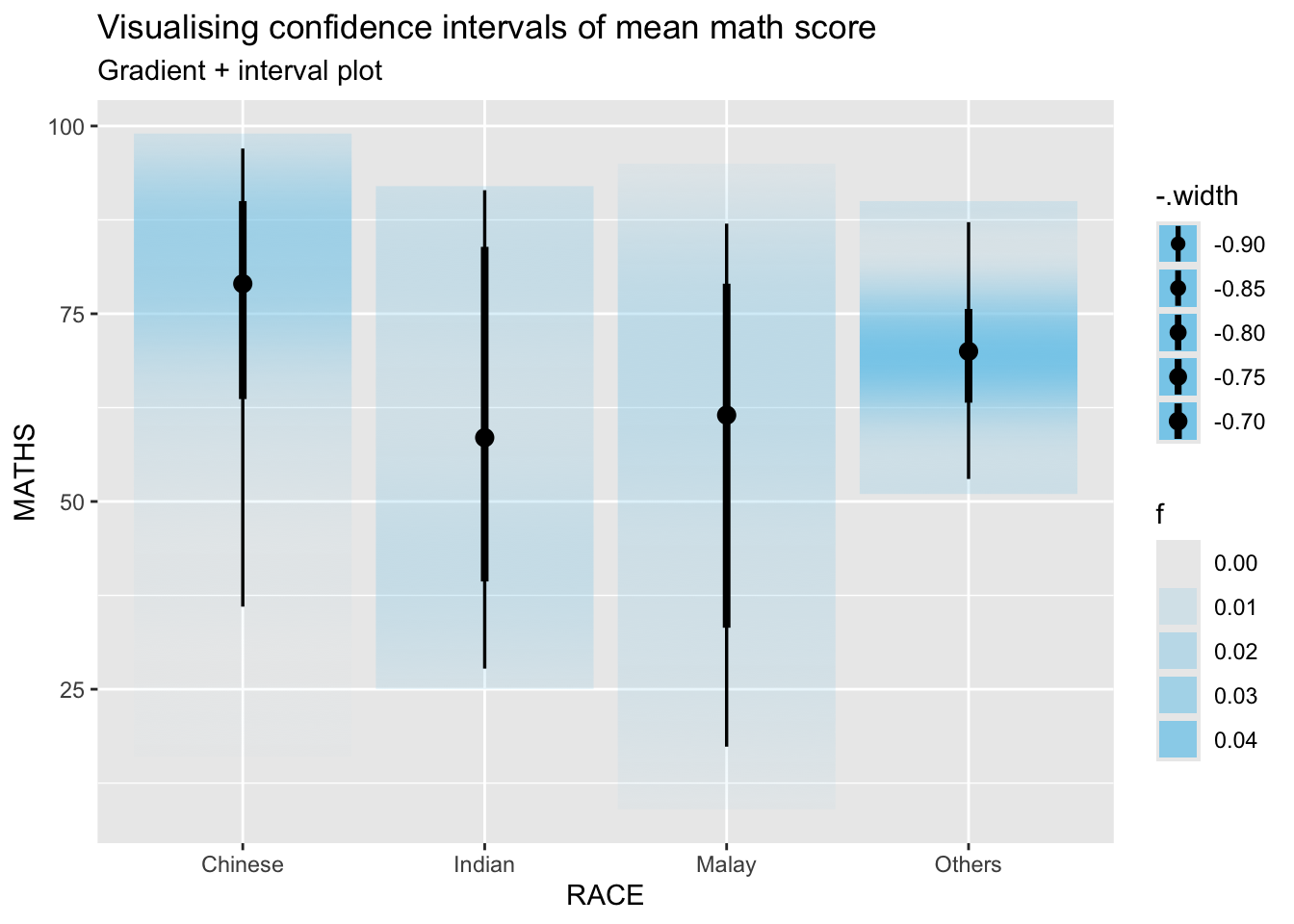
11.5 Hypothetical Outcome Plots (HOPs)
11.5.1 Install and Load ungeviz Package
devtools::install_github("wilkelab/ungeviz")Using GitHub PAT from the git credential store.Skipping install of 'ungeviz' from a github remote, the SHA1 (74e1651b) has not changed since last install.
Use `force = TRUE` to force installationlibrary(ungeviz)11.5.2 Generate HOP Plot
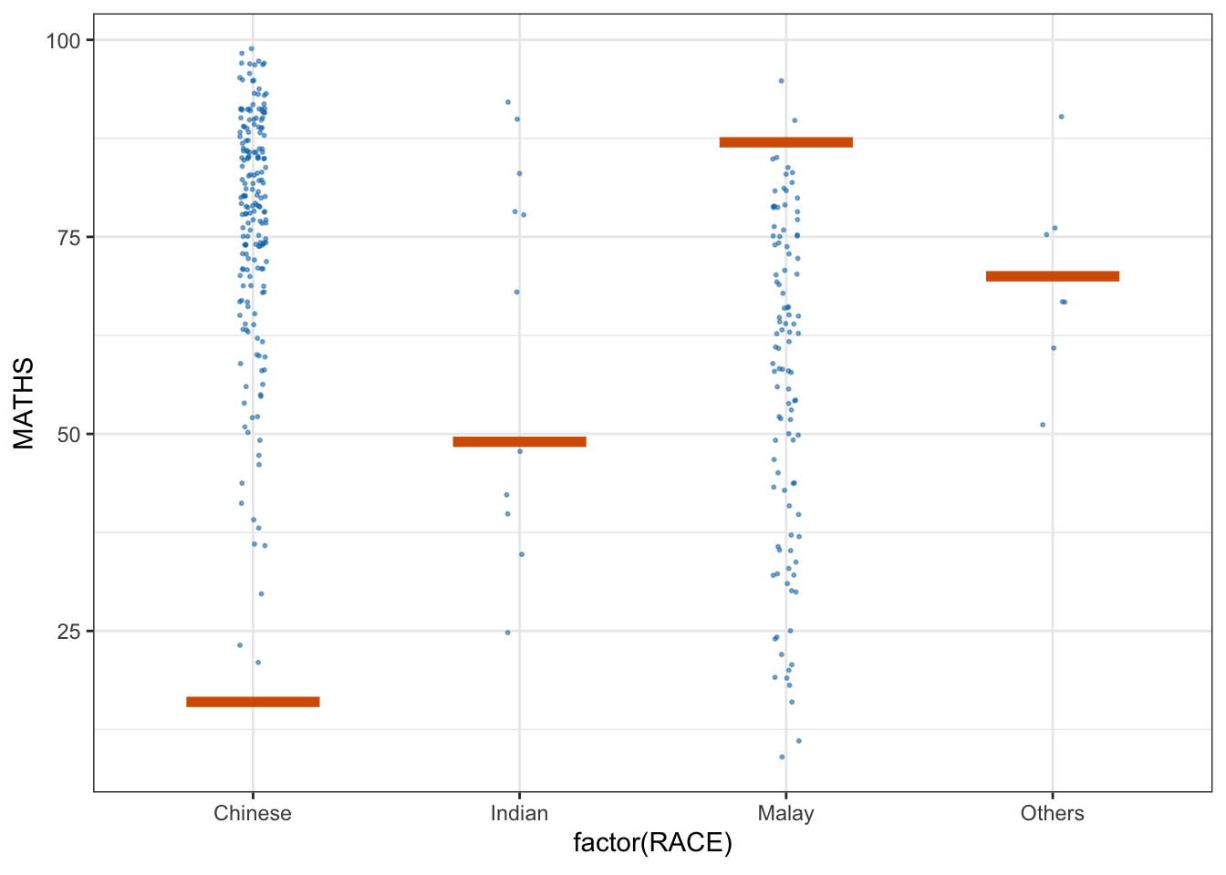
ggplot(data = exam, aes(x = factor(RACE), y = MATHS)) +
  geom_point(position = position_jitter(height = 0.3, width = 0.05),
             size = 0.4, color = "#0072B2", alpha = 1/2) +
  geom_hpline(data = sampler(25, group = RACE),
              height = 0.6, color = "#D55E00") +
  theme_bw() +
  transition_states(.draw, 1, 3)
Warning in geom_hpline(data = sampler(25, group = RACE), height = 0.6, color =
"#D55E00"): Ignoring unknown parameters: `height`